Works

Brand Strategy
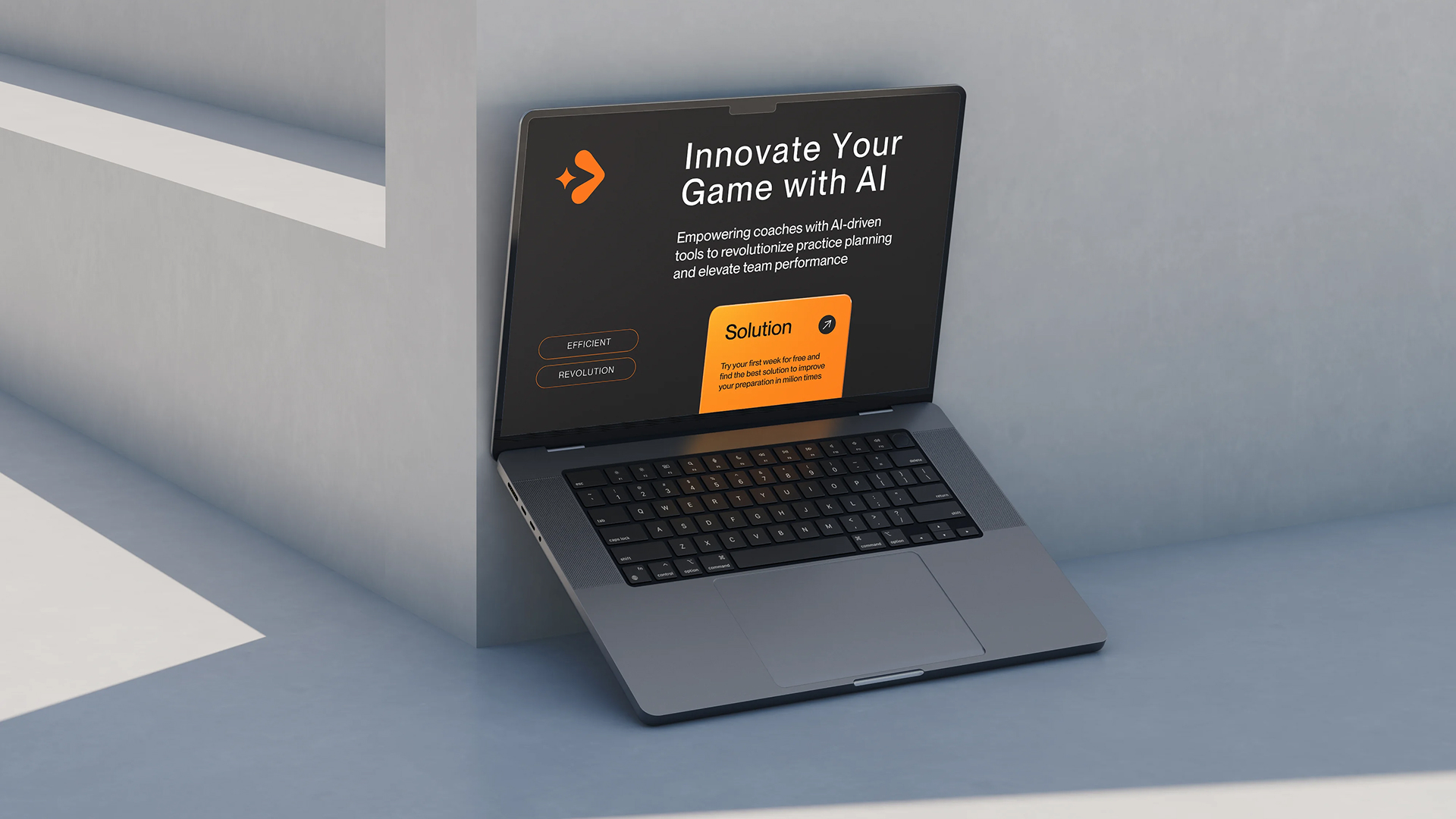
Through workshops and strategic analysis, we identified these key brand pillars:
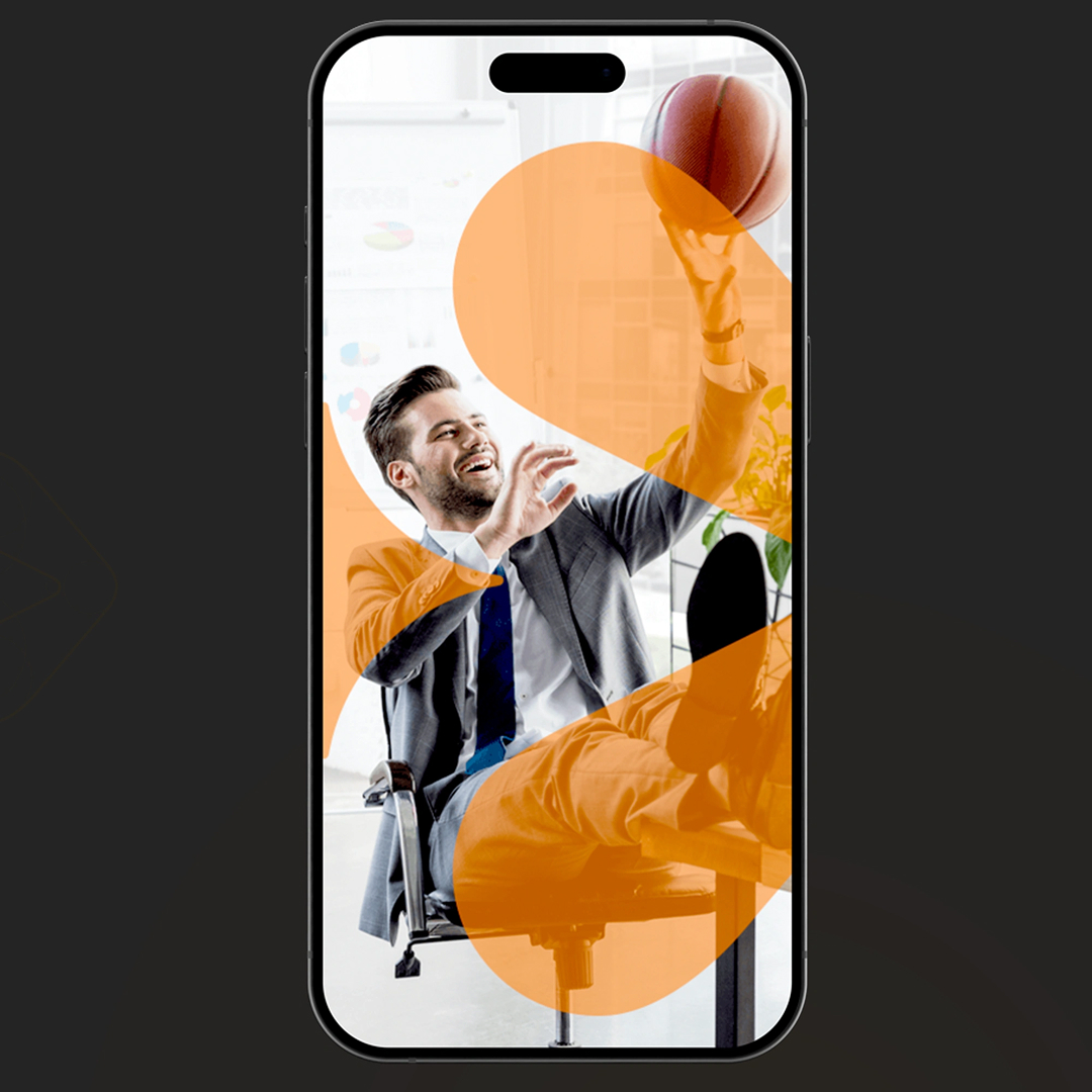
- Innovation: Highlighting Drillia’s cutting-edge AI capabilities.
- Efficiency: Stressing the time-saving features that help coaches focus on what matters most—their teams.
- Empowerment: Enabling coaches to optimize their practice plans and strengthen their team dynamics.
- Community: Building a global network of coaches united by shared knowledge and passion for sports.
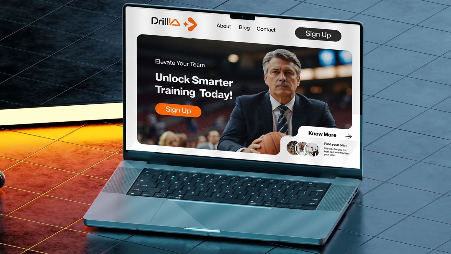
Visual Identity
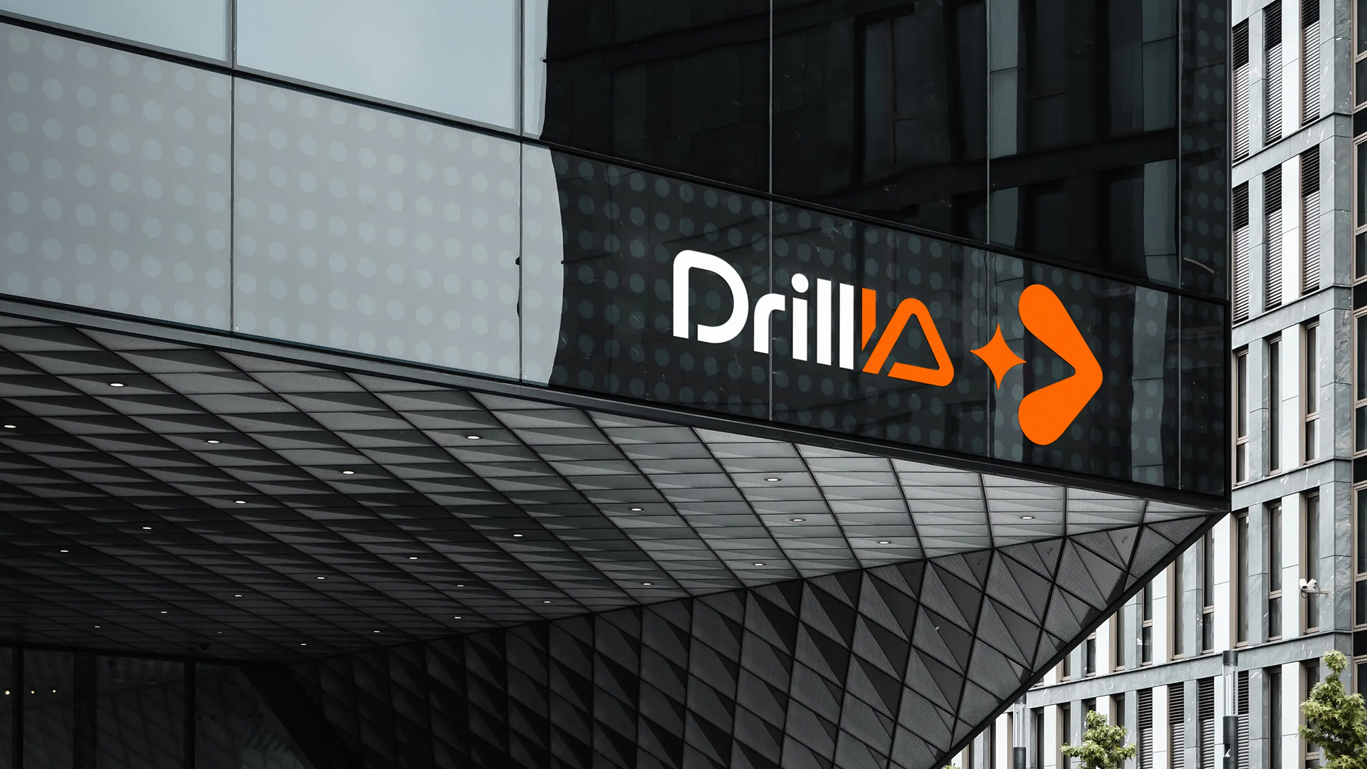
Logo:
The arrow conveys the idea of progress and impoverment
The star symbolizes the AI-driven nature of the platform
Together, the elements of the mark demonstrate that the platform's advanced technology is powered by AI, driving and empowering innovations in sports.
Typography:
Clean and modern san-serif typeface that complements the futurictic and streamlined feel
Colors:
The colors are bold yet professional, reflecting both the tech-driven and human-centric sides of Drillia.


Brand Strategy
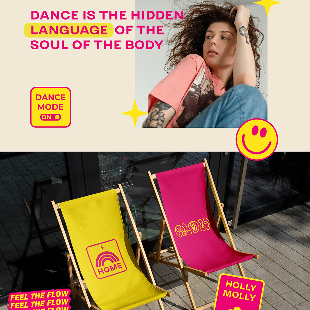
We worked collaboratively with Kate and her team to cultivate a brand image that embodies a comfortable and empowering space. The goal is to encourage confidence, self-expression, and a sense of relaxation, allowing women to embrace and reveal their sexuality through the fluidity of movement.
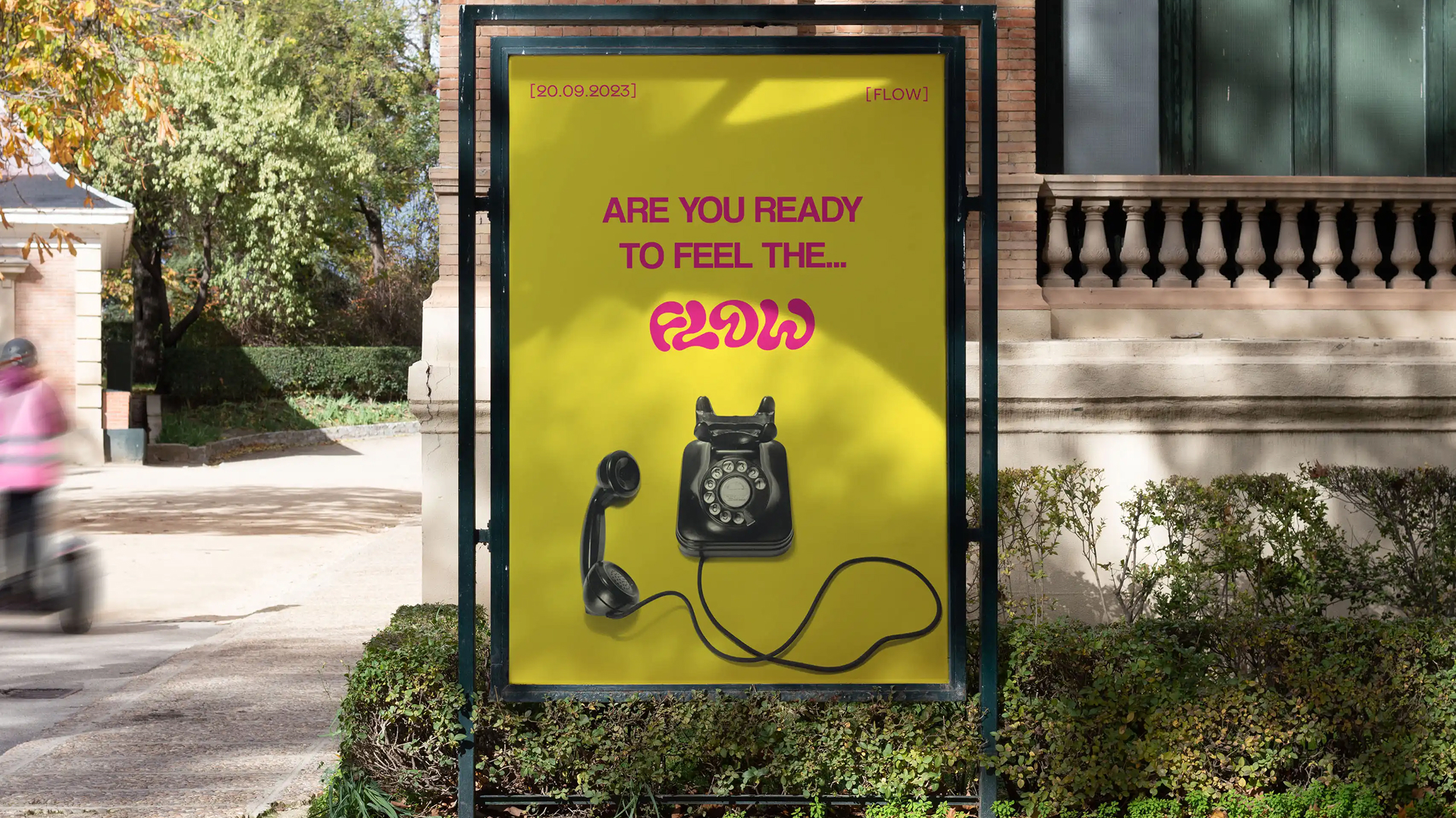
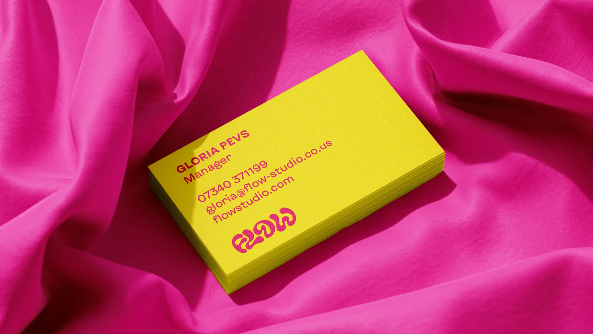
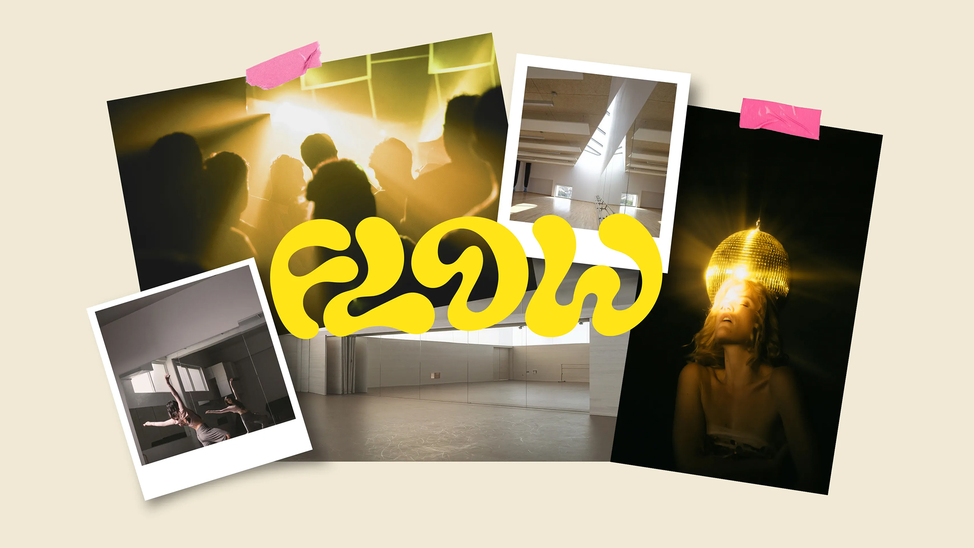
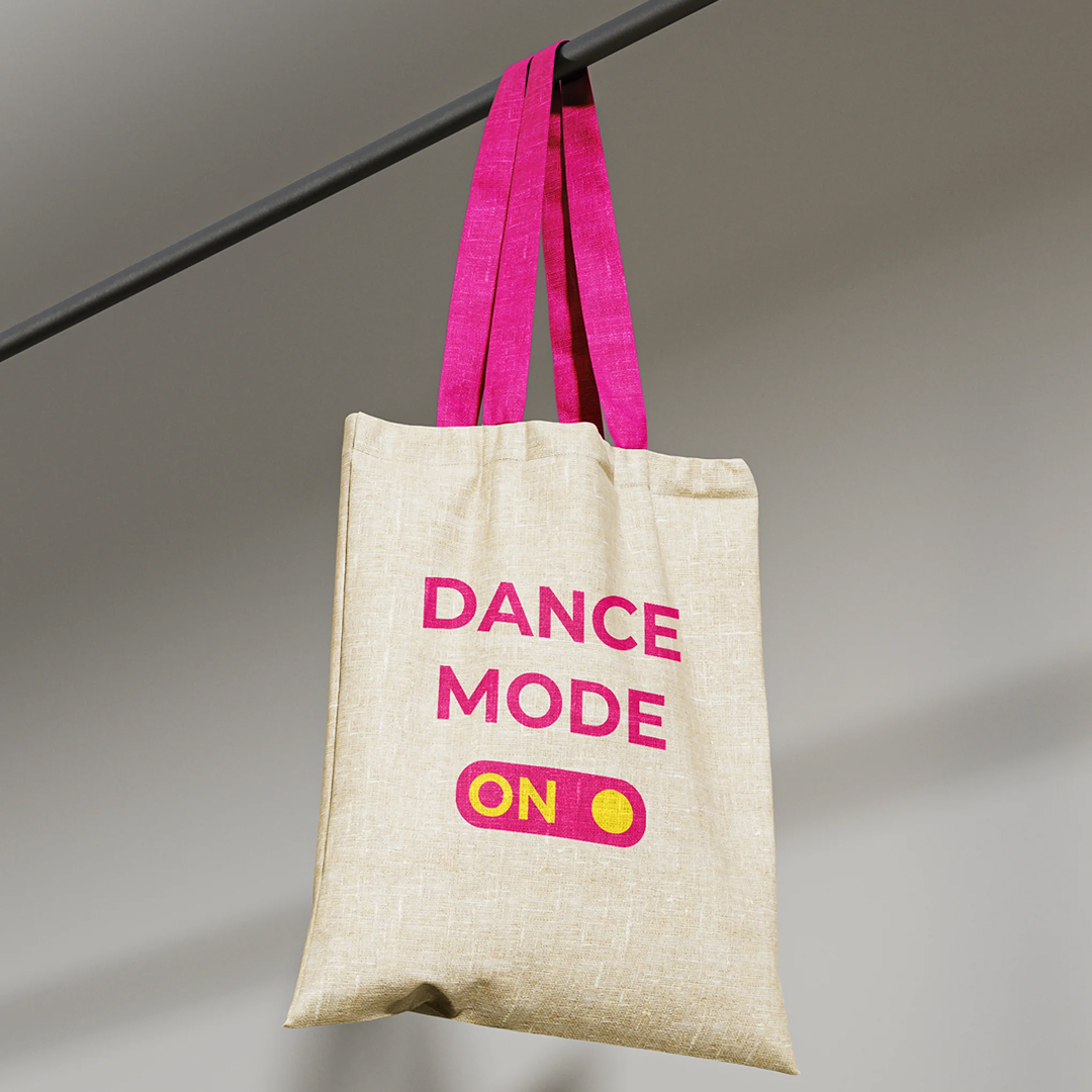
Visual identity
The visual identity features bold and dynamic colors, fluid shapes, and sleek typography that radiate energy and confidence. Playful stickers add a fun, personal touch, reinforcing the studio’s spirit of self-expression and creativity. It’s a modern, empowering look that perfectly matches a space where women can move freely and confidently.
Applications
We created a comprehensive brand experience, including social media templates, and presentation materials. These elements highlight Flow’s mission to empower the community of dance enthusiasts.
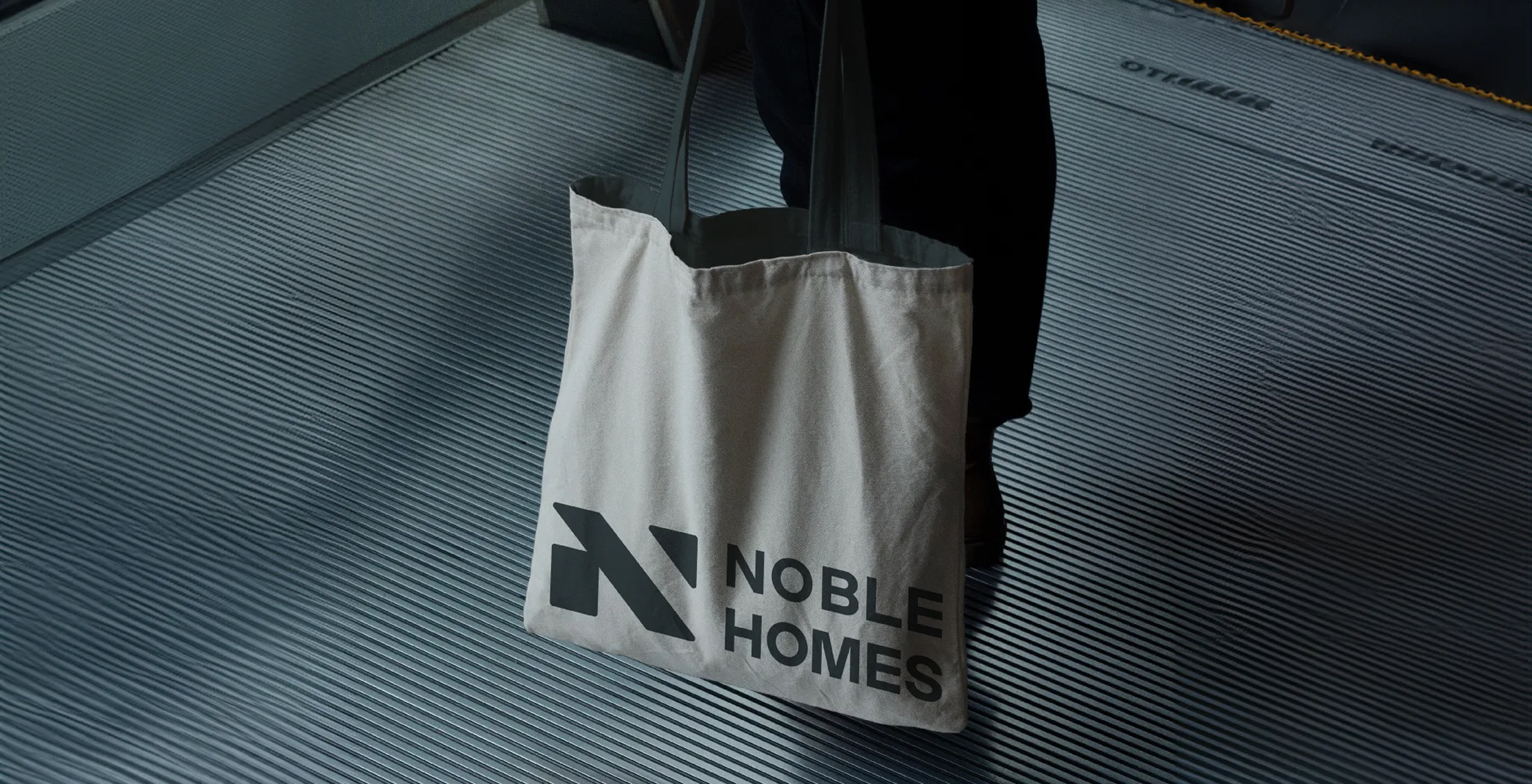

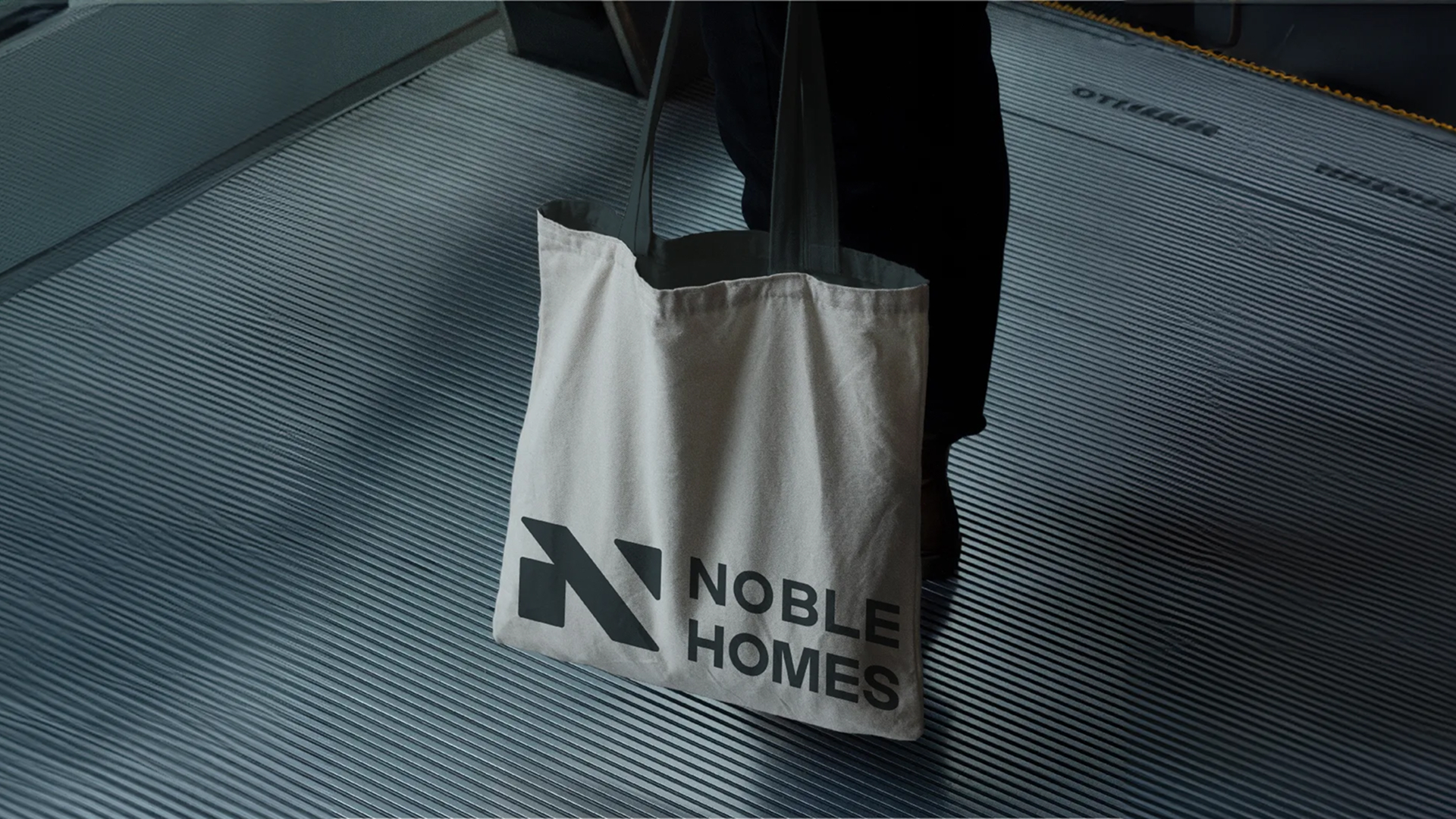
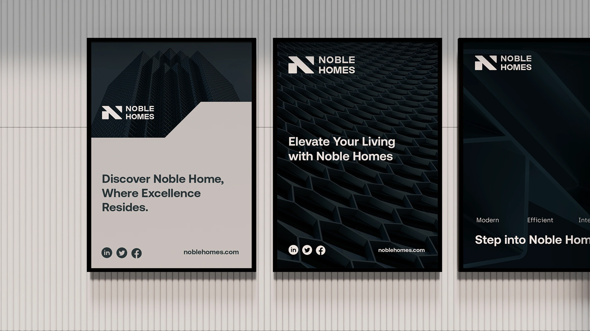
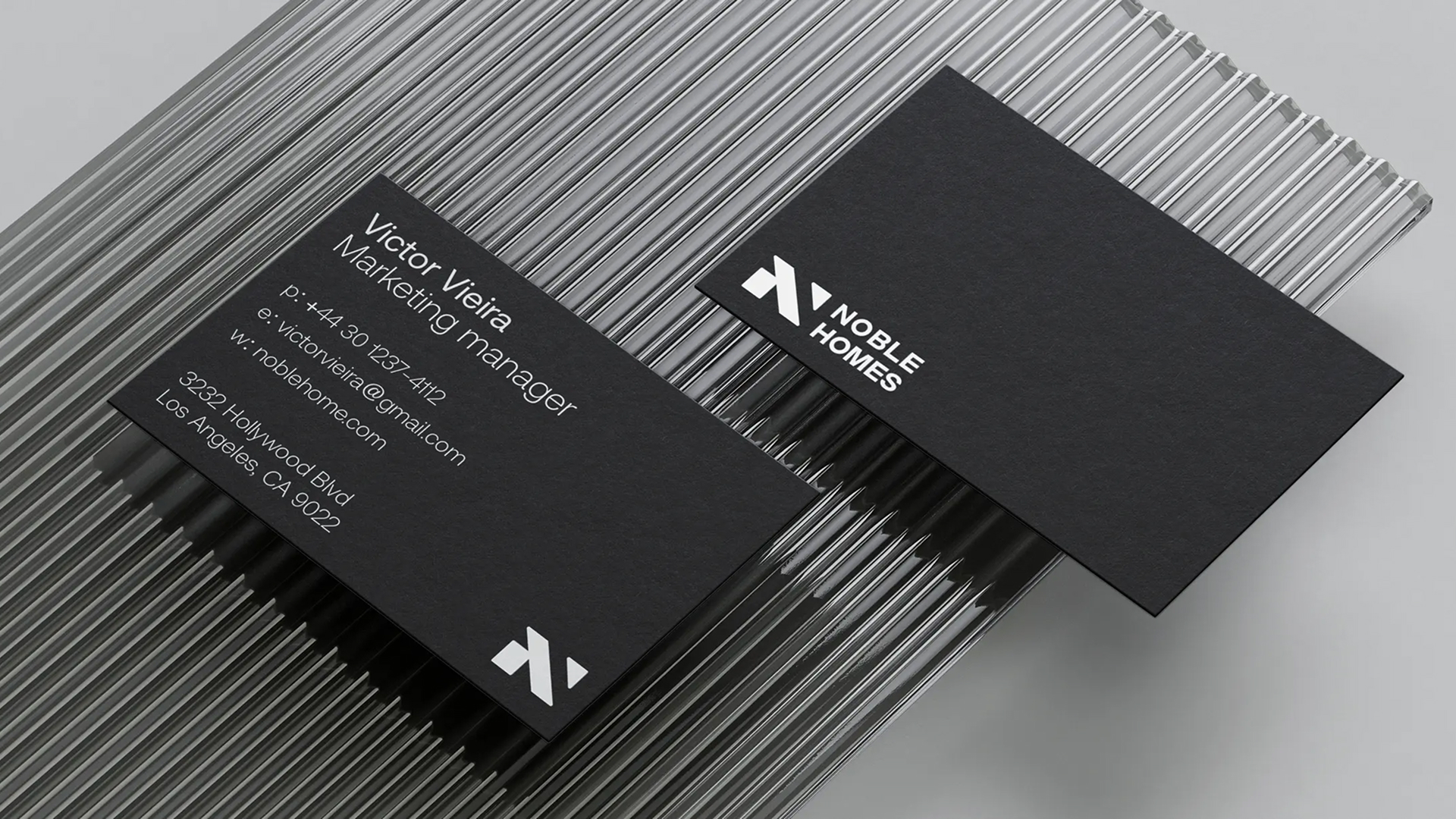
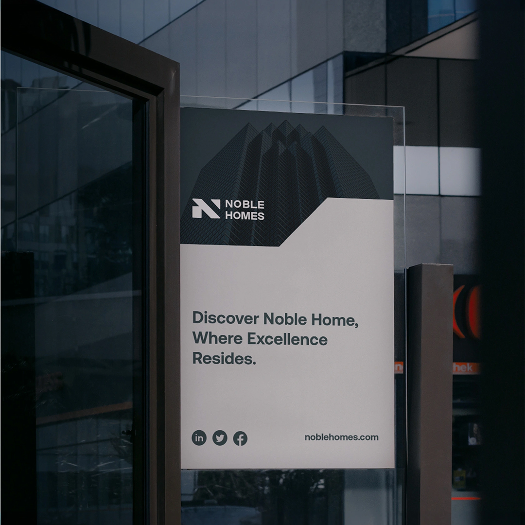
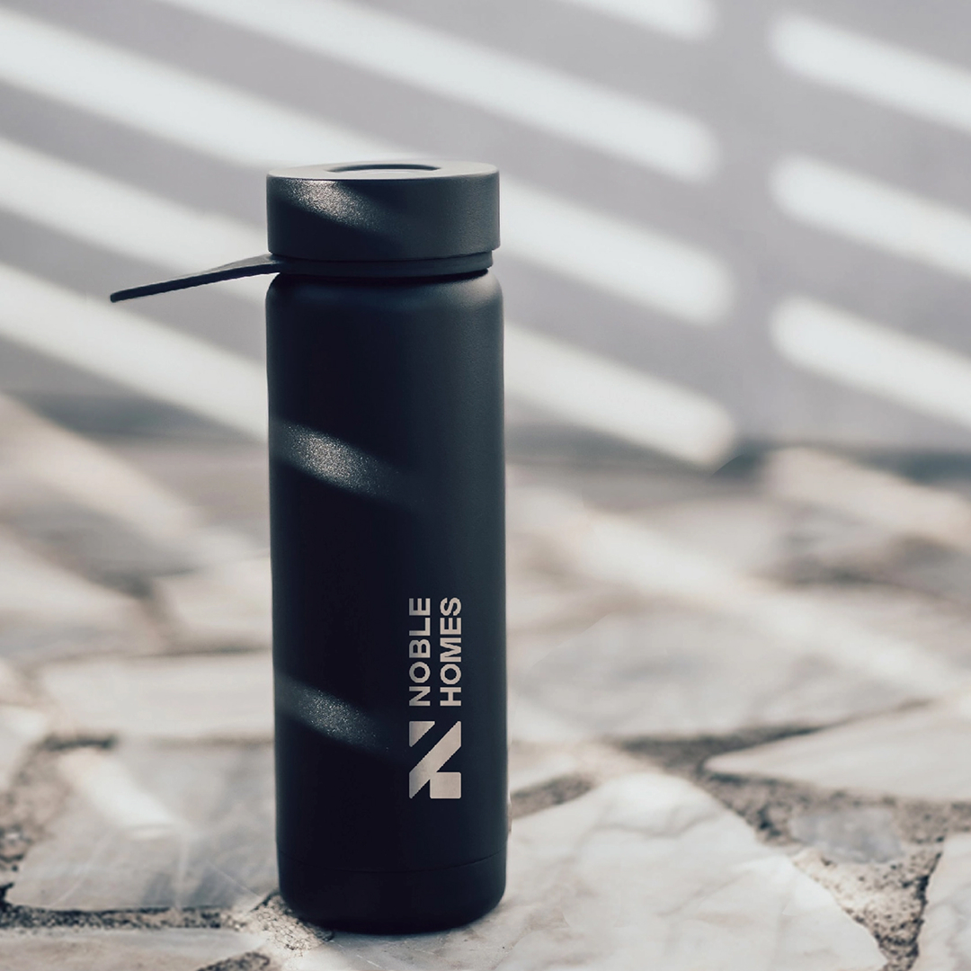
How do we make Noble
Homs the first choice for buyers looking for more than just a house—buyers who want a home that matches their dreams and lifestyle?
Our goal was to create a brand that feels luxurious yet approachable, speaking directly to high-net-worth individuals who value exclusivity, elegance, and a seamless buying experience.

Brand Strategy
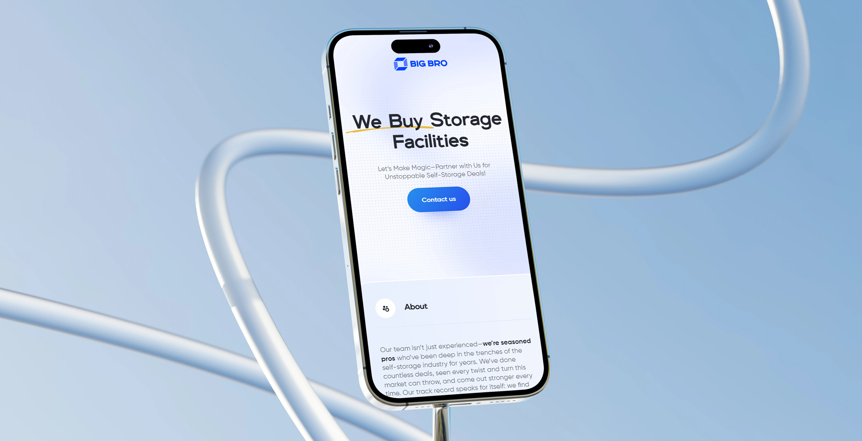
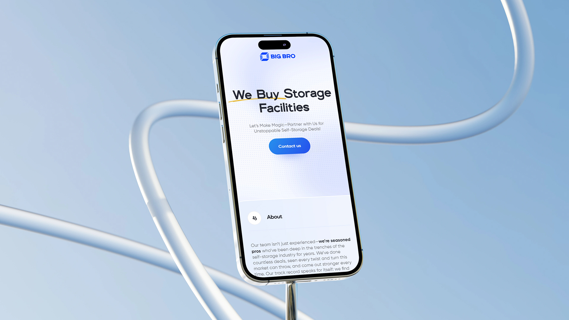
Big Bro Storage set out to be more than just a place to store stuff. The idea was to create a brand that feels like a trusted “Big Brother” for your belongings—someone who makes life simpler, safer, and stress-free. We focused on highlighting Big Bro’s promise of care, security, and a modern, easy-to-use experience to stand out in a crowded market.
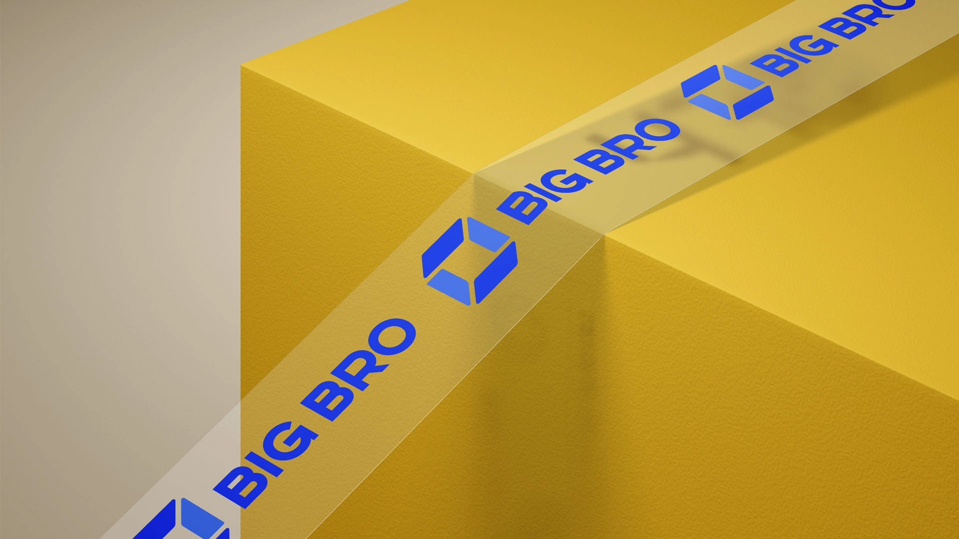
Visual Identity
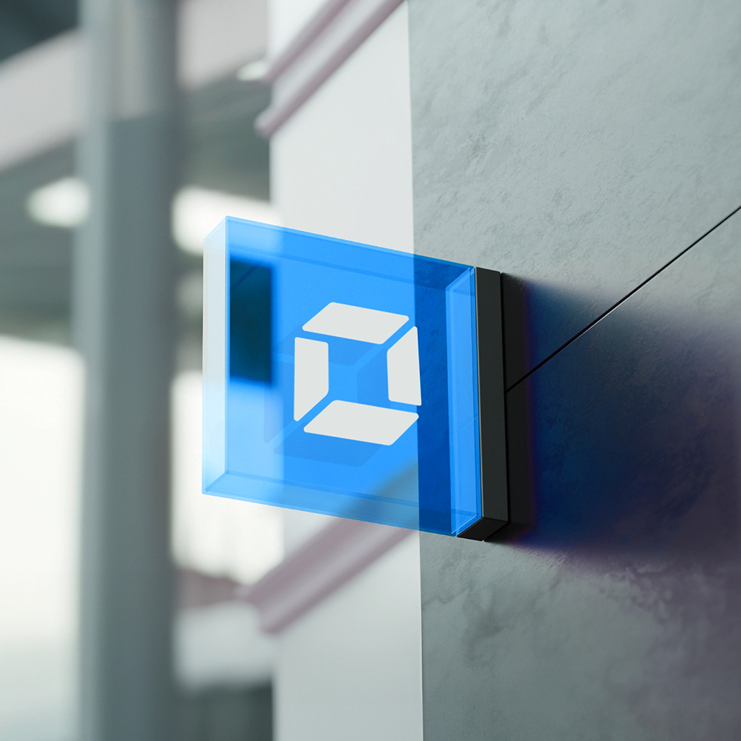
The visual identity blends a bold color palette to convey positivity, trust, and warmth. The pentagon logo symbolizes secure storage, while rounded elements and open spaces emphasize care and clutter relief. The Genova font for headlines delivers modernity and professionalism, paired with Gilroy for approachable, easy-to-read body text.
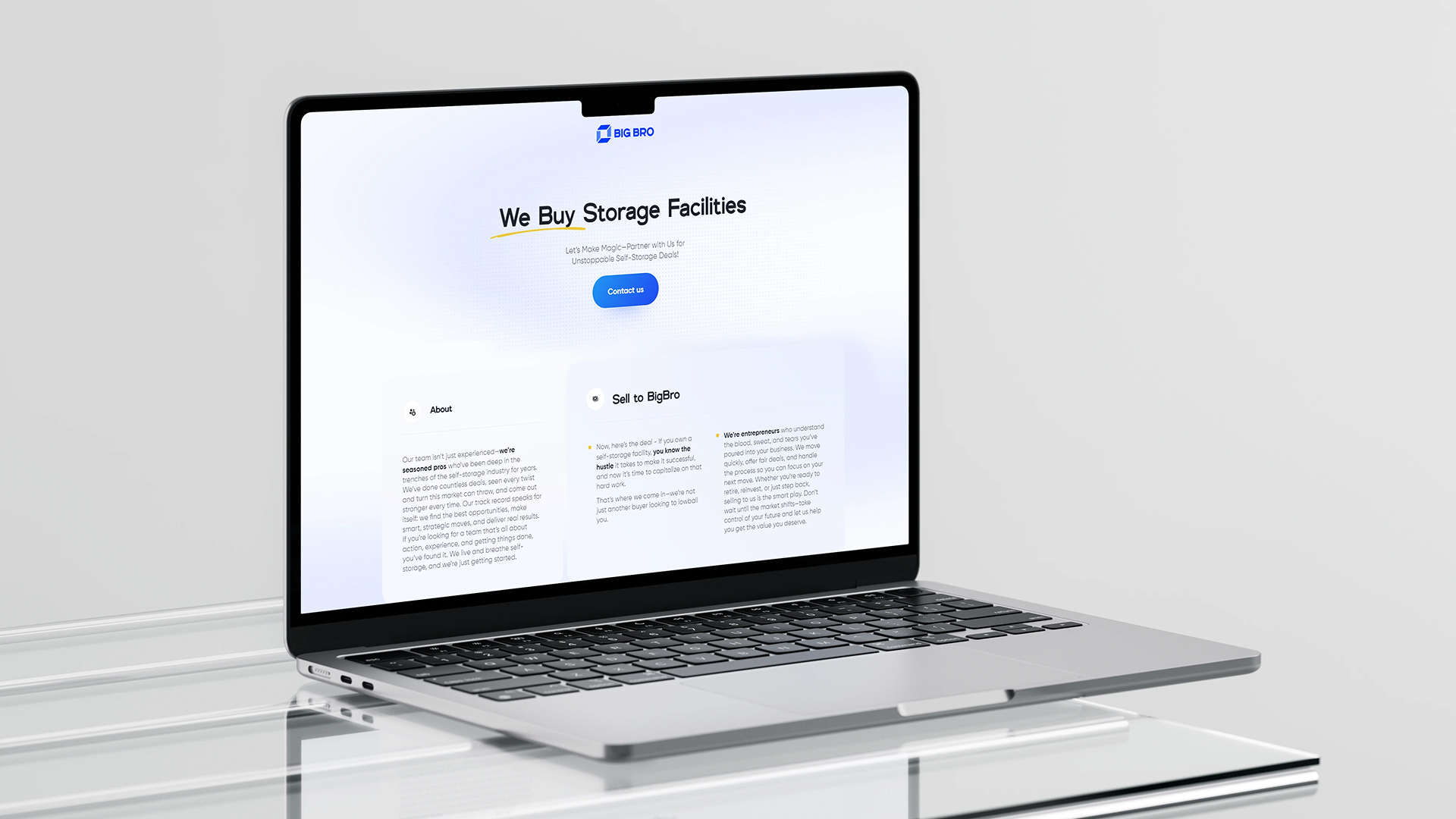
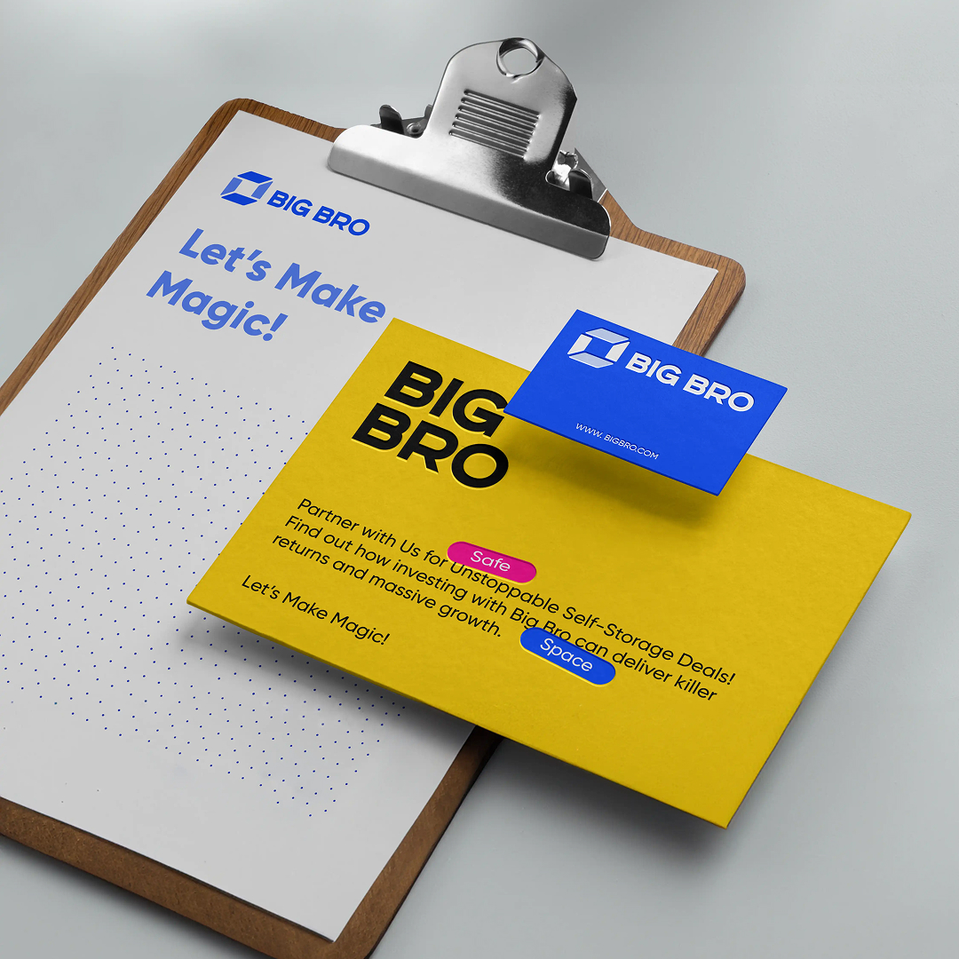
Application
Big Bro’s identity comes to life through clean, engaging visuals across website designs, marketing materials, and social media. Custom imagery of storage units and hands-on care highlights security and friendliness. Vibrant, modern designs with intuitive interfaces ensure a seamless user experience, staying true to the brand’s promise of simplicity and trust.
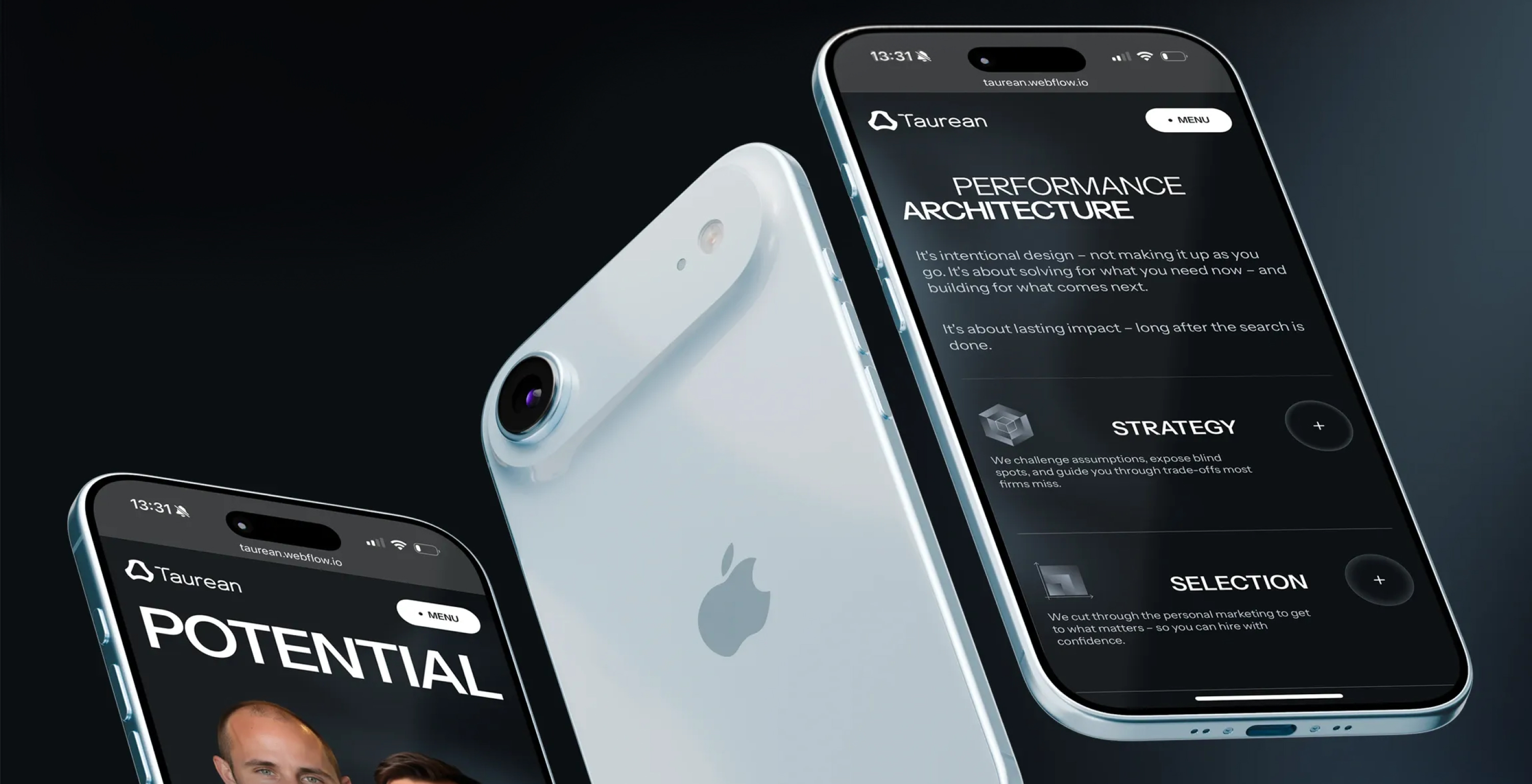

The Challenge
Taurean came to us with a generic look that did not reflect their ambition. The fintech space is crowded, and they needed a brand that communicated trust and innovation at the same time.
Our Approach
We started with a deep brand strategy phase: stakeholder interviews, competitor mapping and positioning workshops. From there we built a visual identity centered on a custom wordmark and a confident, editorial typographic system.
The Result
A complete identity system, design guidelines and a new marketing website. Within three months of launch, demo requests grew by 42%.